Overview #
The data retrieved by Apsona reports can be displayed in a variety different of “visualizations”, such as grouped lists, pivot tables and charts. Such visualizations make it easier to understand data and gain insight into relationships between data. Visualizations are available for both single-step reports and multi-step reports.
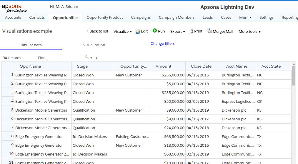
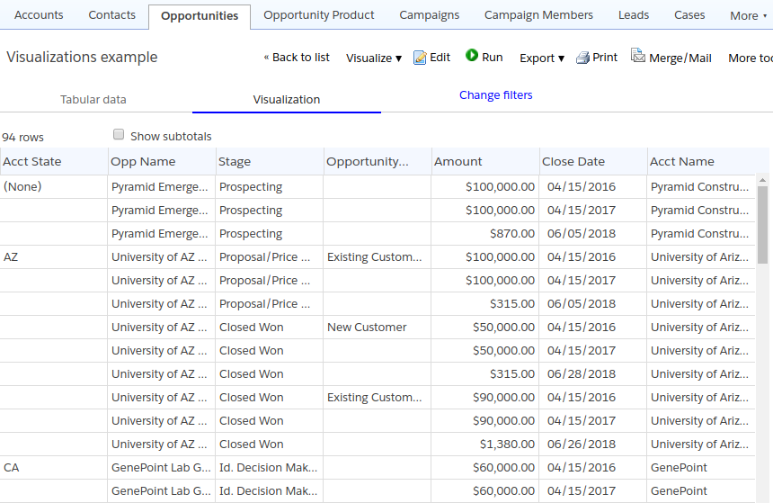
Below is a screenshot of a simple Opportunity report showing a few significant fields from the Opportunity record and the Account to which it belongs. We will use this report as the running example to show a few different visualizations.
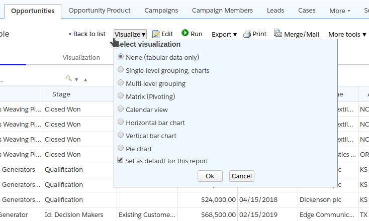
Creating a visualization #
The selected visualization is available under the Visualization tab in the report display. To create a visualization, click the Visualize button at the top, and select the appropriate parameters in the panel that appears, as described below.
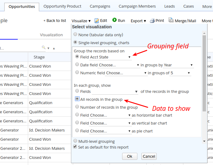
Single-column grouping and charts #
To create a grouping on a report column, select the “Single-level grouping” option. In the parameters area below, select the grouping field and the data to show in each group.
Groups with data records #
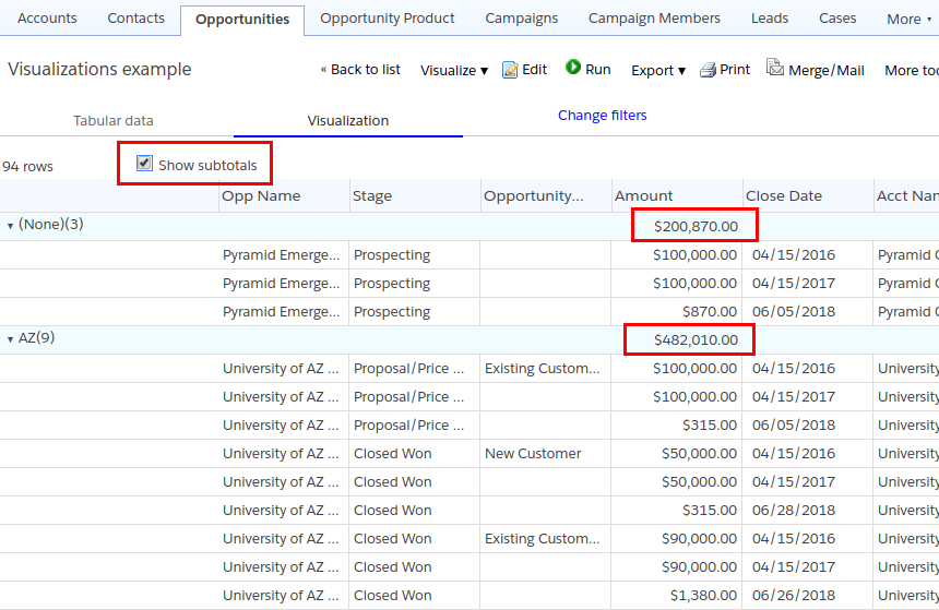
In the first example (below), we group by the Account State column and show all the records in each group.
This results in the grouped display shown below.
Notice, in the above screenshot, that the value of the grouped column (in this example, the Account State) appears on the first row of each group. If you check the “Show subtotals” box, then the grouped column value appears in its own row, along with subtotals for each numeric or currency column, as in the screenshot below.
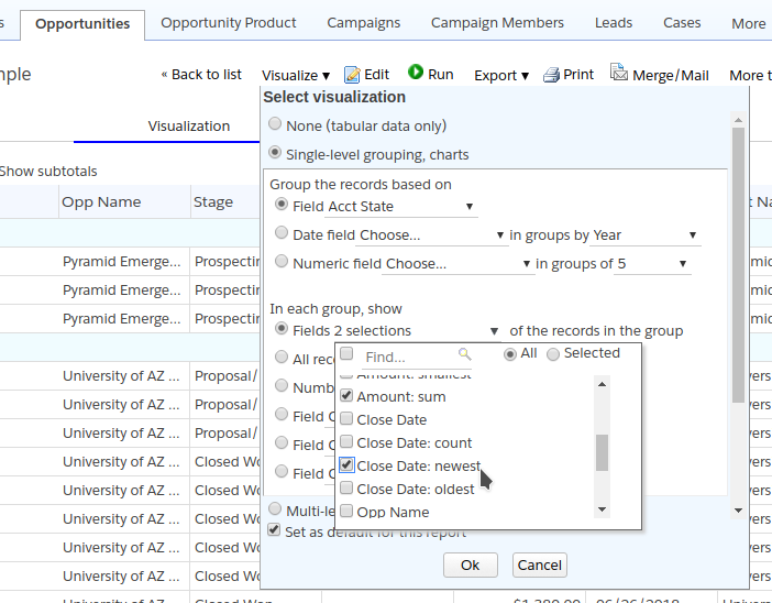
Grouping with aggregation #
Instead of showing the raw data in each group, we can choose “aggregate” functions such as count, smallest, largest, sum or average. In the example below, we show the sum of the Amount column and the newest Close Date.
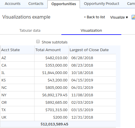
This results in the report shown below. Keep in mind that these calculations are carried out after the raw report data has been retrieved and displayed in the “Tabular data” tab, and then shown in the “Visualization” tab.
The availability of aggregate functions is as follows.
- The count function is available for all fields.
- The smallest and largest functions are available for numeric, currency and date fields (they are called “oldest” and “newest” for date fields).
- The sum and average functions are available only for numeric and currency fields.
Grouping with charts #
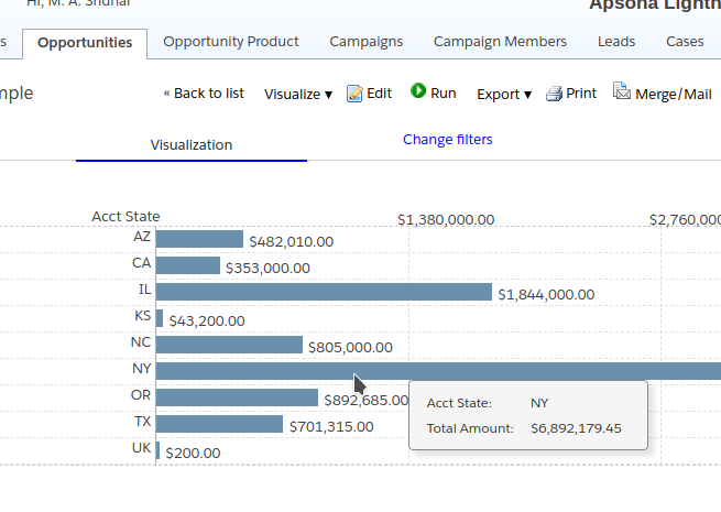
You can also create simple charts with the grouped results. In the example below, we group the results by Account State, and show a horizontal bar chart of the sum of the Amount field for each Account State.
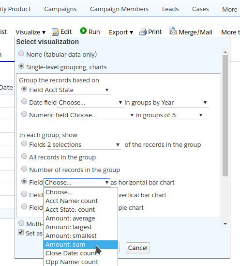
The resulting chart appears below.
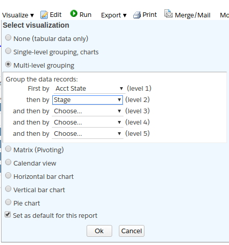
Grouping by multiple fields #
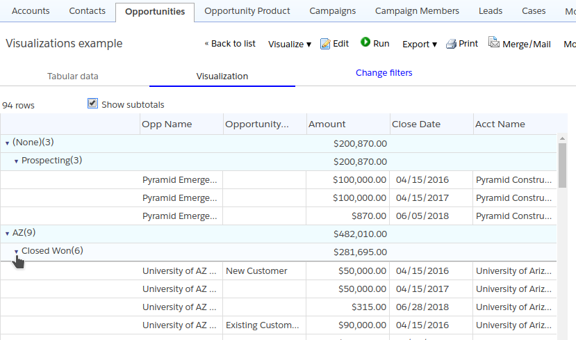
Sometimes it is convenient to display the raw data records grouped by multiple fields. In the example below, we group by the Account State field and then the Opportunity Stage field.
The result is the display below. Notice that you can collapse or expand the groups in the display by clicking the little arrow next to the group label.
Pivot tables #
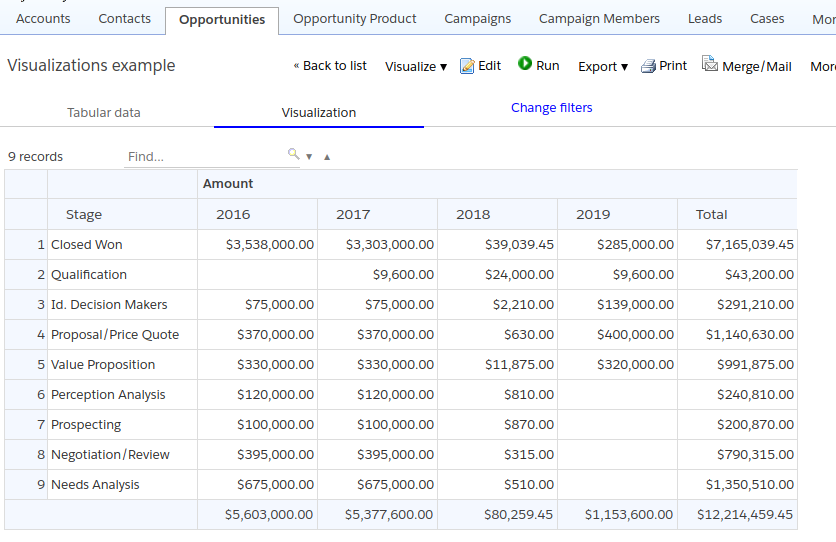
Another common need is to show the data in pivoted or matrix form. In the example below, we set the parameters to show the rows of the matrix grouped by Stage and the columns grouped by the year of the Close Date. The cells in the matrix show the sum of the Amount column.
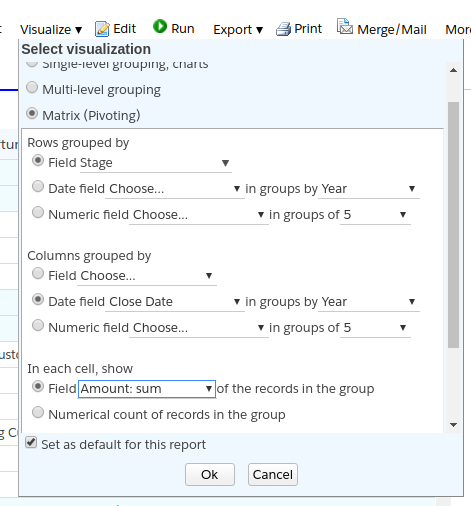
The result is the display shown below.
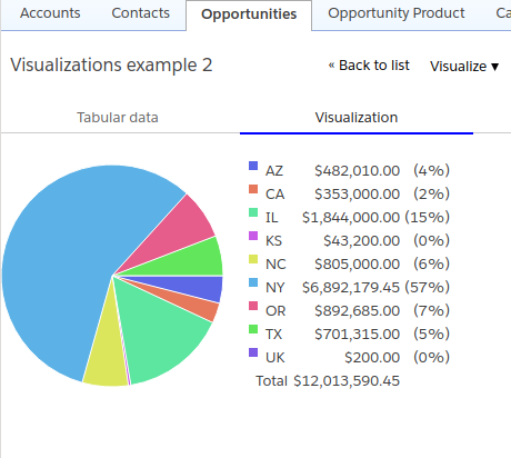
Simple charts #
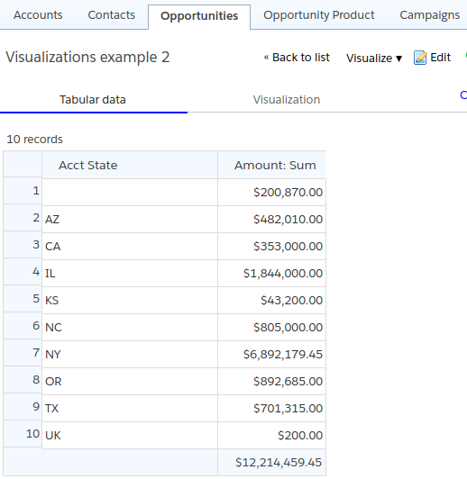
You can also create reports in which the data have already been aggregated, The example report below differs from the running example above, in that the tabular data has already aggregated the Amount by State.
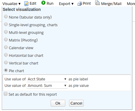
In such a situation, we can create charts directly from the tabular data, without any additional aggregation. Below is a screenshot showing the settings for a pie chart.
The resulting chart appears below.