Segment, slice and dice your data at will with Apsona’s Charting and dashboard add-on. This new add-on is the latest entrant to the Apsona suite of products. The question we were frequently asked was, “As Apsona reporting is so powerful, why can we not see the report data as charts and in dashboards?” Now, with Apsona’s Charting and dashboards, you can visualize and analyze your data in real time, right within your Salesforce org in your browser – there is no exchange of data with an external data warehouse.
Apsona charting supports several types of charts – horizontal and vertical bar charts, pie and line charts, KPI’s and Pivot tables. More chart types are on the way. You can create powerful charts with it – charts that cannot be constructed with native Salesforce. One example that comes to mind is a chart with multiple “layers”. A multi-layer chart is one that contains two or more charts overlaid on each other. For example, you can create a two-layer chart with one layer containing Campaign and expenditure information, overlaid with a second layer containing Campaign and Opportunity revenue information. This way, you can get a side-by-side view of two related metrics (expenditure and revenue) in the same chart – even if those metrics are not available from the same report or object. You can also apply filter conditions to each layer if required. Layers can be added to vertical and horizontal bar charts.
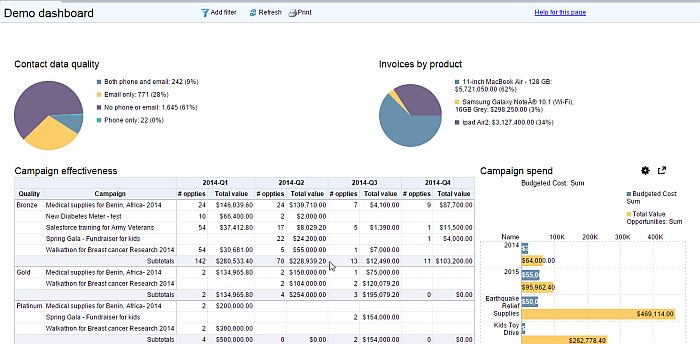
Another powerful visualization available is the pivot table. With this device, you can use multiple dimensions in the rows and columns and metrics in the cells. You can also use multiple metrics in the cells, and essentially get all of the benefits of an Excel pivot table right in your browser.
Most organizations set goals and use metrics to measure performance towards those goals. This is where dashboards come in handy. You can now present the storyboard of your data as an Apsona dashboard. An Apsona dashboard is basically a collection of Apsona charts. It can include a combination of charts, and can easily be edited and previewed, and its charts resized and repositioned. You can add an Apsona dashboard to a Salesforce Home page and also as a related list in a Salesforce object.
To try out Apsona Charting and dashboards, please click the Feedback link in Apsona for Salesforce and send us a request. We look forward to feedback and suggestions on this add-on.