Overview #
This short article shows how to create simple charts with Apsona’s Excel Generator. It assumes that you are familiar with the Document Generator in general (details here) and how to create Excel templates (details here).
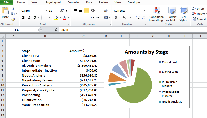
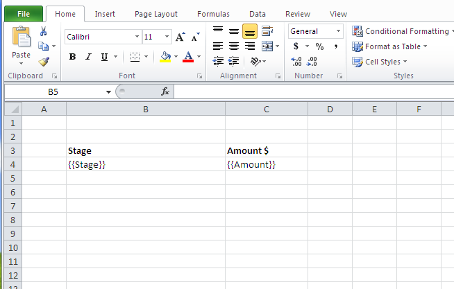
For this example, we will use a template with just two columns, containing the Opportunity Stage and the Total Amount, respectively. We will produce a pie chart containing the stage names and total amounts. The basic idea is to use two named ranges, one for the labels and one for the values. We rely on the fact that Apsona’s Document Generator automatically expands the named ranges to fit the actual data values produced in the result. You can use this technique for creating other chart types too, such as bar charts or scatter plots.
Steps #
1. Create a template #
Begin by creating a template that will contain the raw data.
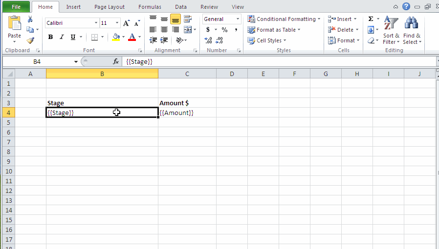
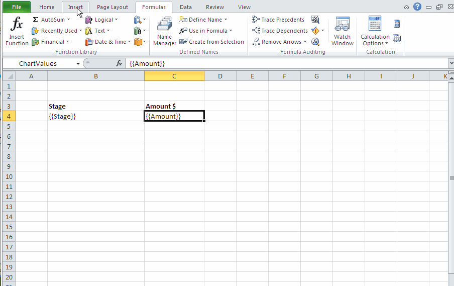
2. Create a named range for the labels #
For the template cell containing the stage name, create a named range with name ChartLabels, which contains just the one template cell that produces the labels. (Click the image to rerun the animation.)
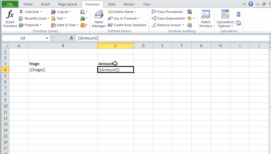
3. Create a named range for the values #
For the template cell containing the amount, create a second named range with name ChartValues, containing just the template cell for the amounts. (Click the image to rerun the animation.)
4. Create the chart #
Insert a pie chart, and set its data source so that its labels come from the ChartLabels named range, and its values come from the ChartValues named range. Notice that, in the “Edit Series” popup, we fill the “Series name” field with the caption for the chart. (Click the image to rerun the animation.)
5. Use the template #
Use this template against a report that produces the raw data, as described in the Excel Generator article. Below is an example of what the result might look like. If you wish, you can download the Excel template.