This article describes how to create a Lightning Web Component (LWC) that allows a user to select one of several Decument Merge Actions and run the selected action. This article assumes that you are familiar with Lightning Web Components, the sfdx tool, and HTML, CSS and JavaScript. Salesforce has excellent documentation for Lightning Web Components.
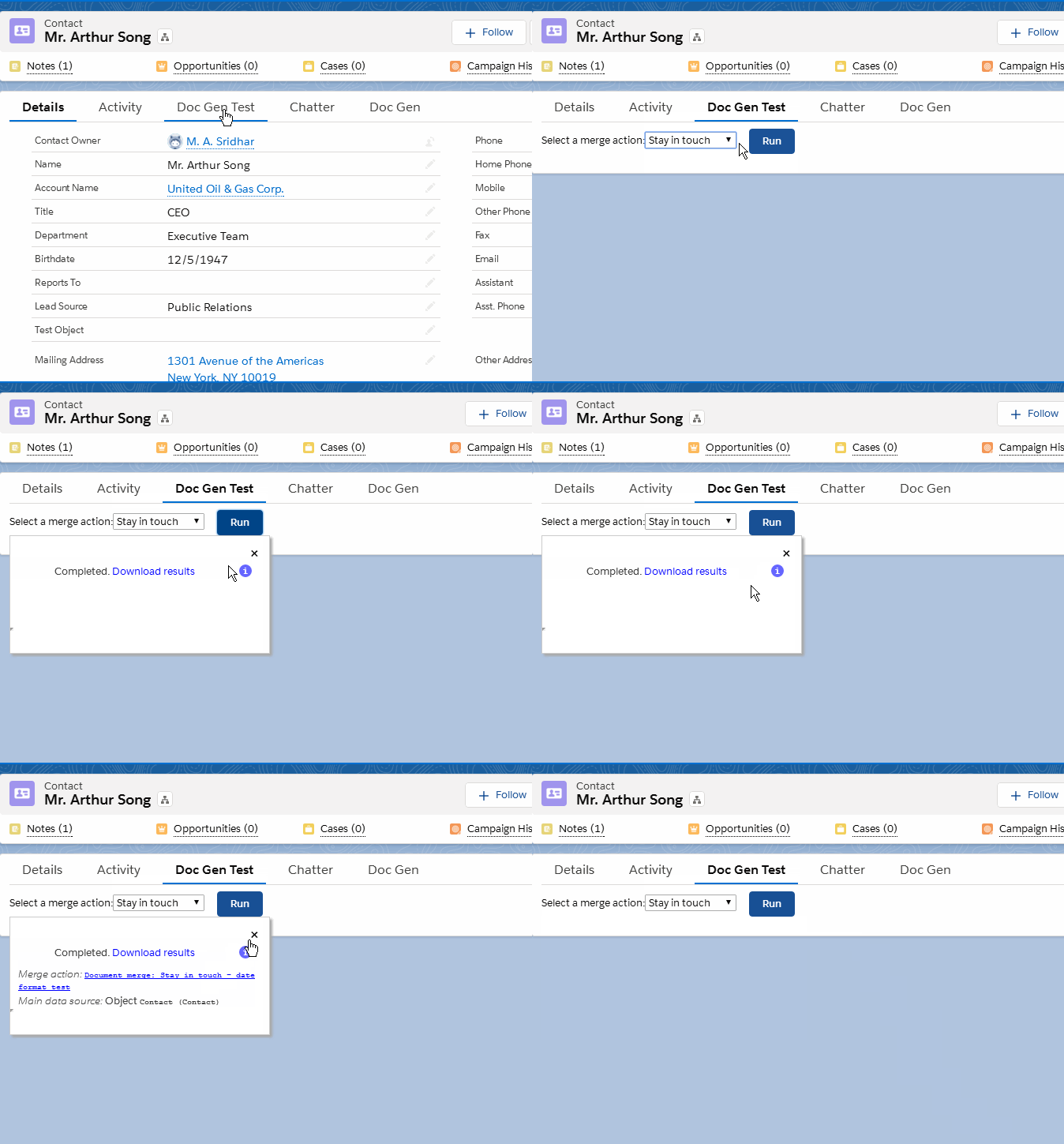
The user experience provided by this component is shown in the animation below. It is similar to the one produced by the Button Lightning Component, except that in this case, the user can select from one of the available merge actions and then run it.

This component is made of three small files (you can download a zip file containing the component):
-
An HTML file containing the template markup for the component, shown below. The select element with class
doc-gen-selectorshows the list of available actions. For each available action to show in this selector:- use the button code generator to generate the button code
- copy that action code as the
valueattribute, and the name you want shown for that action as the option text.
<template> <div style="position:relative;" class="wrapper"> Select a merge action: <select class="doc-gen-selector"> <option value="action code 1">Action name 1</option> <option value="action code 2">Action name 2</option> </select> <button title="Run the selected action" type="button" class="slds-button slds-button_brand" style="margin-left: 1rem" onclick={runButtonClicked}>Run</button> <div class="popup"> <button class="close-popup" onclick={closePopup}>×</button> <div class="popup-body"> <iframe class="iframe"></iframe> </div> </div> </div> </template> -
A CSS file
docGenSelector.csscontaining the style information:.popup { position: absolute; width: 330px; height: 150px; border: 1px solid #ccc; background-color: white; box-shadow: 3px 3px 3px #aaa; display: none; } .popup-body { margin-top: 8%; width: 100%; height: 90%; display: block; } .close-popup { position: absolute; top: 0.1rem; right: 1rem; width: 1rem; height: 1rem; border: none; background: none; font-size: 1.5rem; } .iframe { display: block; width: 320px; height: 120px; border: none; } -
A JavaScript file that drives the behavior of the component – see the code below.
			import { LightningElement, api } from 'lwc';

			const APSONA_URI = "/apex/apsona__ApsonaForSalesforce?showHeader=false&apsona_loc=lex.docgen.nopopup";

			export default class DocGenSelector extends LightningElement {
    		@api recordId; // Make it available as this.recordId below

    		runButtonClicked (event) {
				// Show the popup
				var popup = this.template.querySelector (".popup");
				popup.style.display = "block";

				// Get the action code that the user selected
				var actionSelector = this.template.querySelector (".doc-gen-selector");
				var actionCode = actionSelector.options[actionSelector.selectedIndex].value;

				// Run the corresponding merge action
				popup.querySelector (".iframe").src = APSONA_URI + "&actionCode=" + actionCode + "&recordId=" + this.recordId;
			}

			closePopup () {
				this.template.querySelector (".popup").style.display = "none";
			}
			}
The component’s class contains two methods, closePopup which closes the popup when the user clicks the x button, and runButtonClicked which actually runs the merge action. To run the merge action, the code invokes Apsona’s Visualforce page in an iframe, with the appropriate parameters. Notice that this.recordId refers to the record ID of the record shown in the detail page where the component lives. For example, if you create a component for Contact detail pages, this.recordId will contain the record ID of the Contact on that page. The @api recordId annotation at the top of the class ensures that Salesforce sets up this variable correctly.
How to use #
To use this component:
- Create an
sfdxproject if you have not already done so. - Download the component zip file and unzip it into the
force-app/main/default/lwcfolder in your project. - Generate the action codes for the actions you wish to include in your selector, and update the template markup in the file
docGenSelector.htmlto include those codes as indicated above. - Deploy the updated component into your org using
sfdx.
You will then have the component available for use in your Lightning page builder, and you can drag and drop it into whatever position you want on the page.